LMArena is now Arena
What began as a PhD research experiment to compare AI language models has grown over time into something broader, shaped by the people who use it.
What began as a PhD research experiment to compare AI language models has grown over time into something broader, shaped by the people who use it.
A global community of millions brought real-world prompts, expert judgment, new modalities, and diverse ways of working with AI. What started as an academic research project at UC Berkeley evolved into a global platform for evaluating how AI actually performs in practice. We’re excited to share today our new look and feel to match our scientific mission: to measure and advance the frontier of AI for real-world use.
That evolution is why we are now Arena. Now available at: arena.ai.
Animation by Fern Studio
Why “Arena”
Our Arena is a transparent, shared space. It is where frontier AI capabilities are tested, compared, and shaped by human judgement. Every day, people use Arena to stress-test models with real tasks—writing, coding, reasoning, designing, searching, and creating. Those interactions generate signals of real-world utility that no static benchmark can capture on its own.
When we developed Chatbot Arena three years ago, we coined the term “Arena” for a place where models compete to be judged by real users. Now that our platform has become the de facto Arena, we have outgrown the “LM,” and it’s time to drop it.
Our Approach
We worked closely with our friends at Alright Studio to craft the visual identity and strategy for our new brand. When we started on this journey, we had a very strong idea of how we wanted our brand to feel: trustworthy, precise, academic, and prestigious. Having started with Chatbot Arena, we wanted to really own the concept that we created. Alright helped us translate those concepts into a cohesive, unique brand that encompasses everything we are in a way that feels uniquely us.
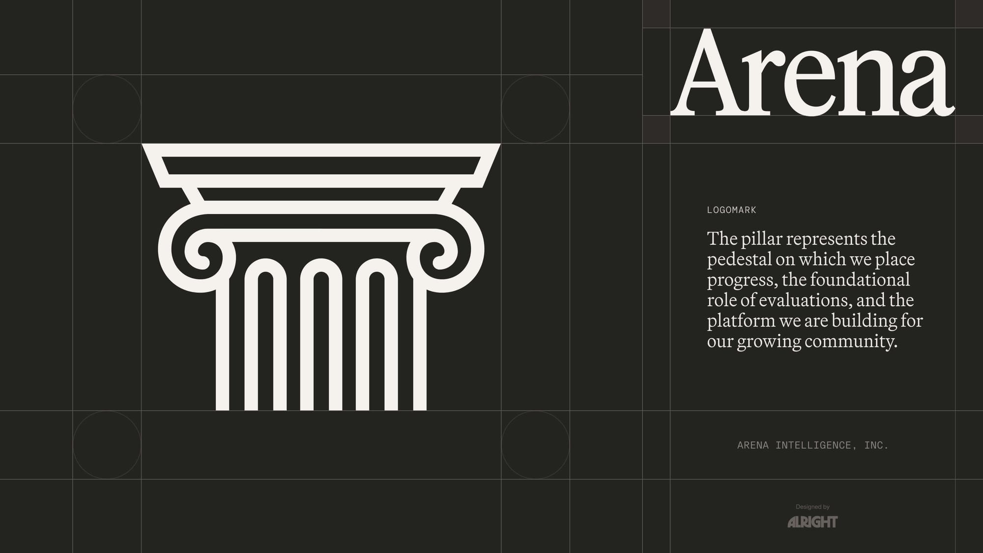
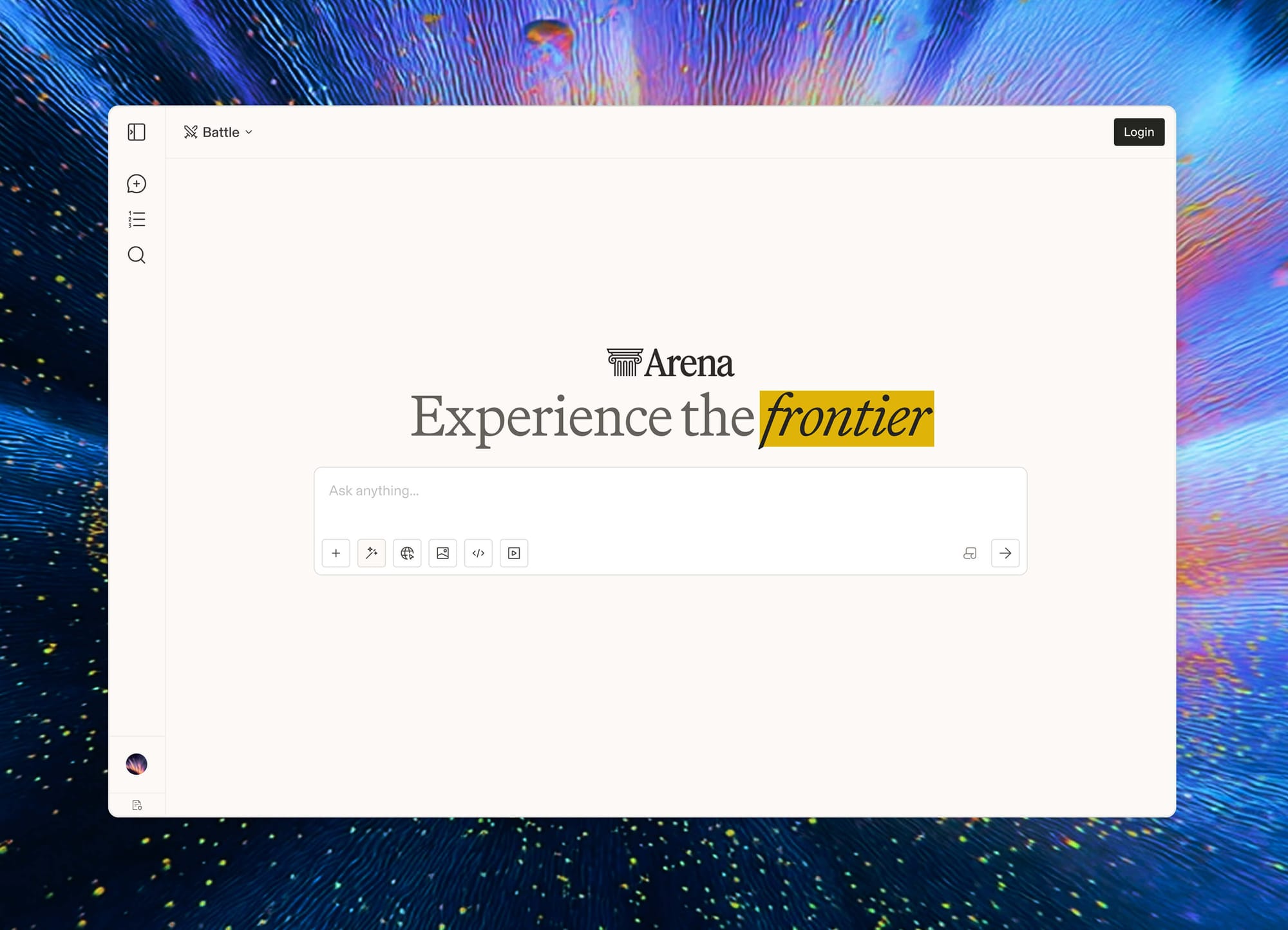
Introducing the Pillar
The pillar represents the pedestal on which we place progress, the foundational role of evaluations, and the platform we are building for our growing community.
After exploring dozens of potential logos, we landed on a mark that symbolizes the Arena without the complexity of showing an entire coliseum. Our new logo was intentionally crafted to feel premium, technical, and strongly rooted in trust.
Typography, Color, & Layout
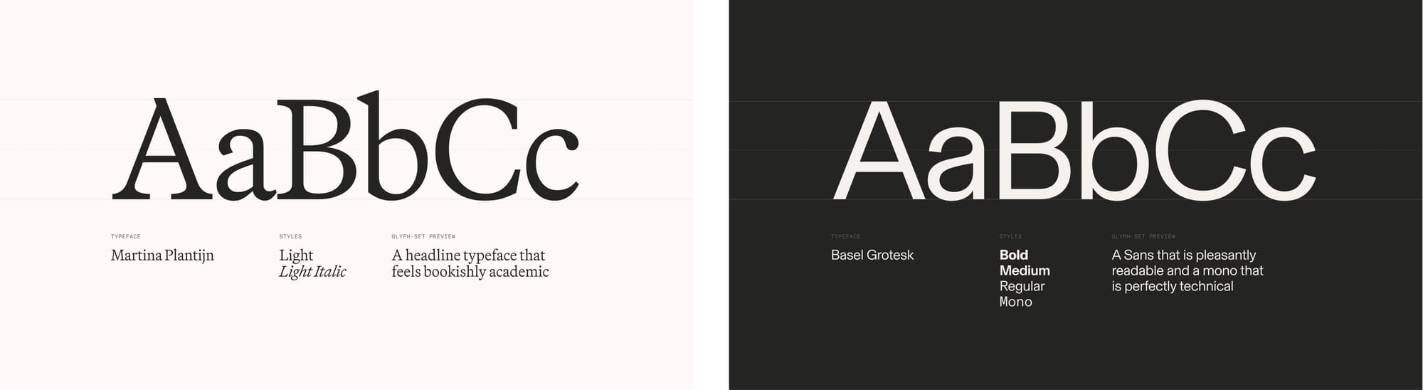
Our new typography system introduces a bookishly academic serif, Martina Plantjin by Klim Type Foundry, with the simple, geometric type family, Basel by Optimo, utilizing its sans serifs for clean readability and its mono-space fonts for our more technical details.
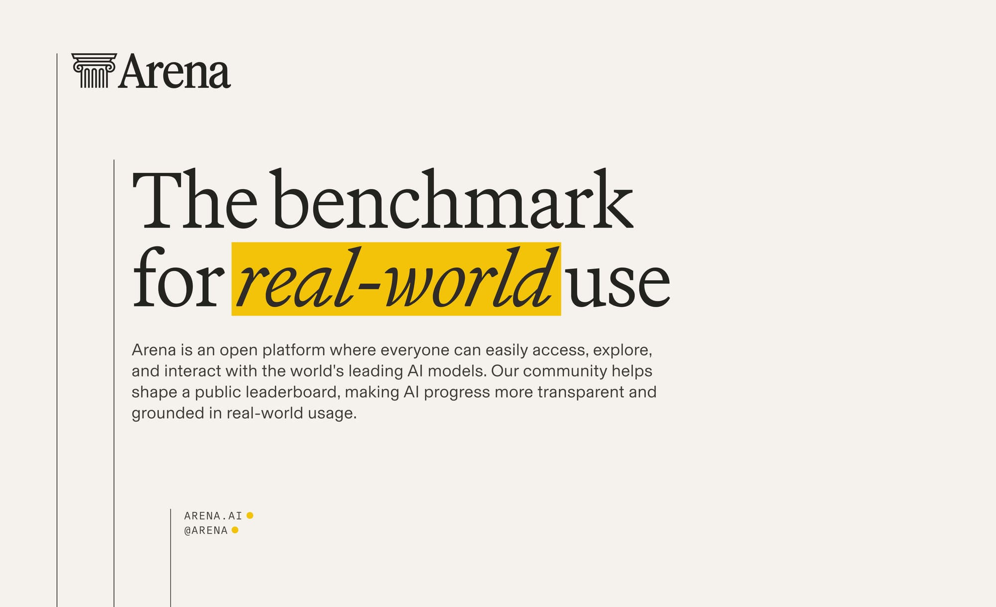
In practice, the serif headlines can be italicized and highlighted to place emphasis on meaning and elevate insights. We anchor the typography with these thin vertical lines that give the layout a sense of measurement and symbolize the pillar.
With this comes a new set of colors that are warm and vibrant. The word “arena” in latin (harena) means “sand,” which is why our new pallet has a hint of yellow in it. This warm tint also makes the lighter colors feel like a weathered notebook page.
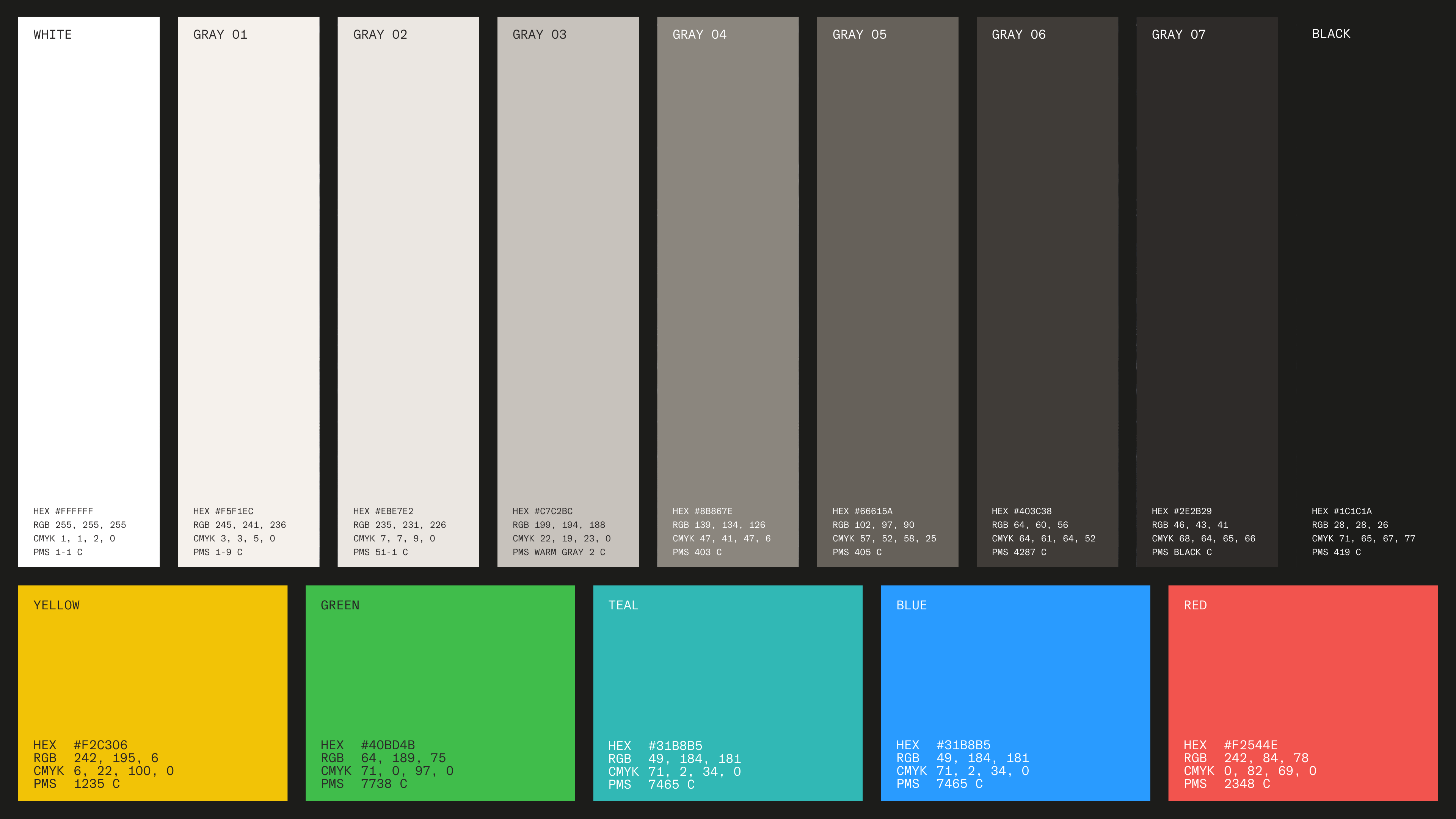
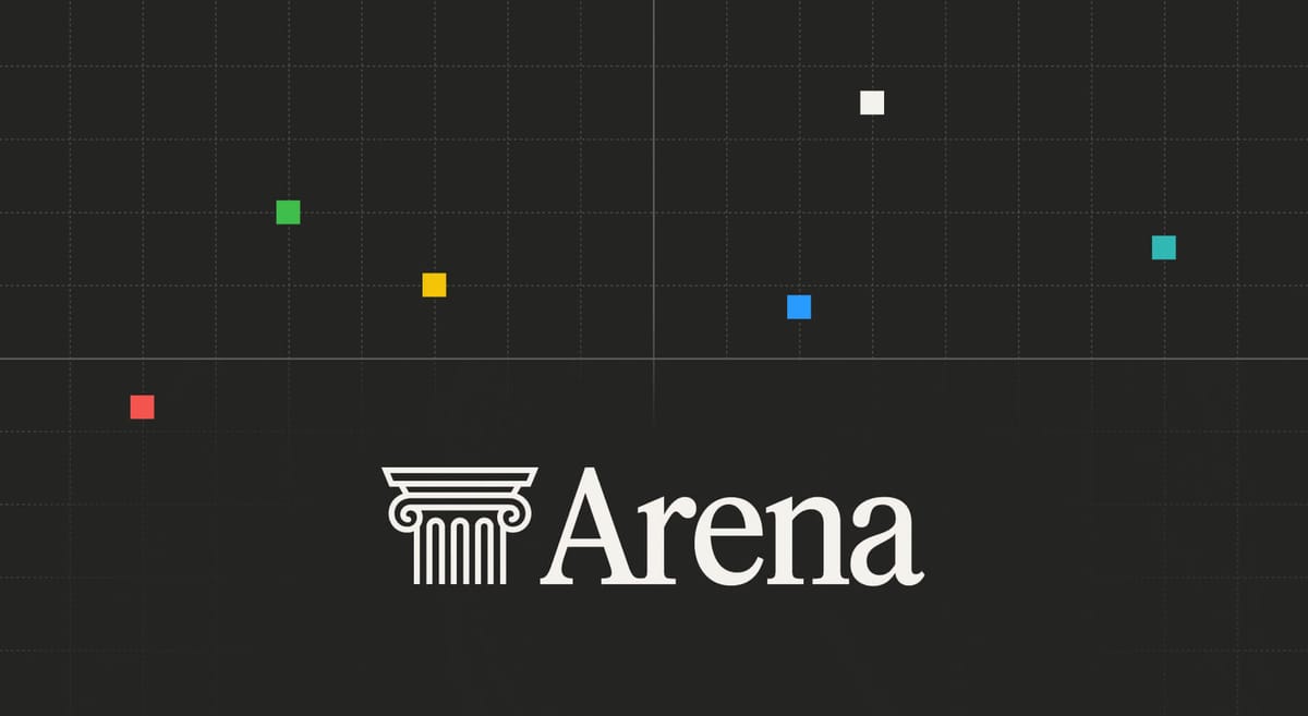
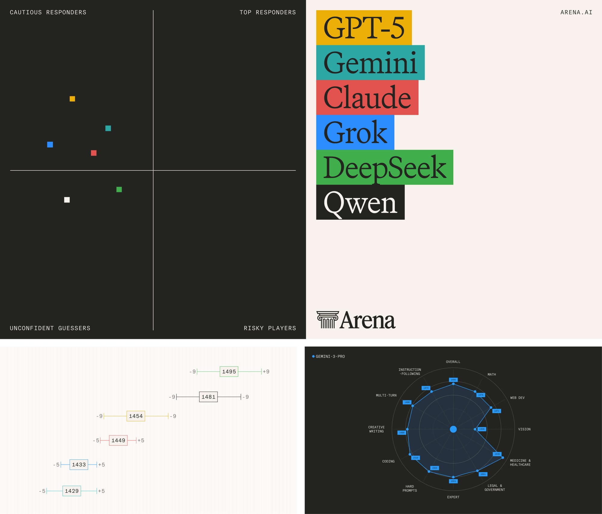
The darks give the sense of a worn leatherback textbook. The brand colors (yellow, red, blue, green, and teal) have a very scholastic feel to them and work splendidly in our plots and graphs.
Welcome to the New Arena
We are unveiling our new look and opening up the new Arena to everyone at arena.ai today. This new brand represents the next phase of our company, moving us from a small research project to a platform with more than 5 million monthly users across 150 countries and 60 million conversations a month. This new visual system will allow us to deliver high-quality products to our community and customers alike. We’re looking forward to growing this brand to meet the needs of everyone who uses our platform.
Want more Arena?
- Join the team: arena.ai/jobs
- Join the conversation: discord.gg/lmarena
- Follow us on X: @arena
- Follow us on LinkedIn: @ArenaAI